Chapter 5 – Combining the indicators
Combined positive indicators
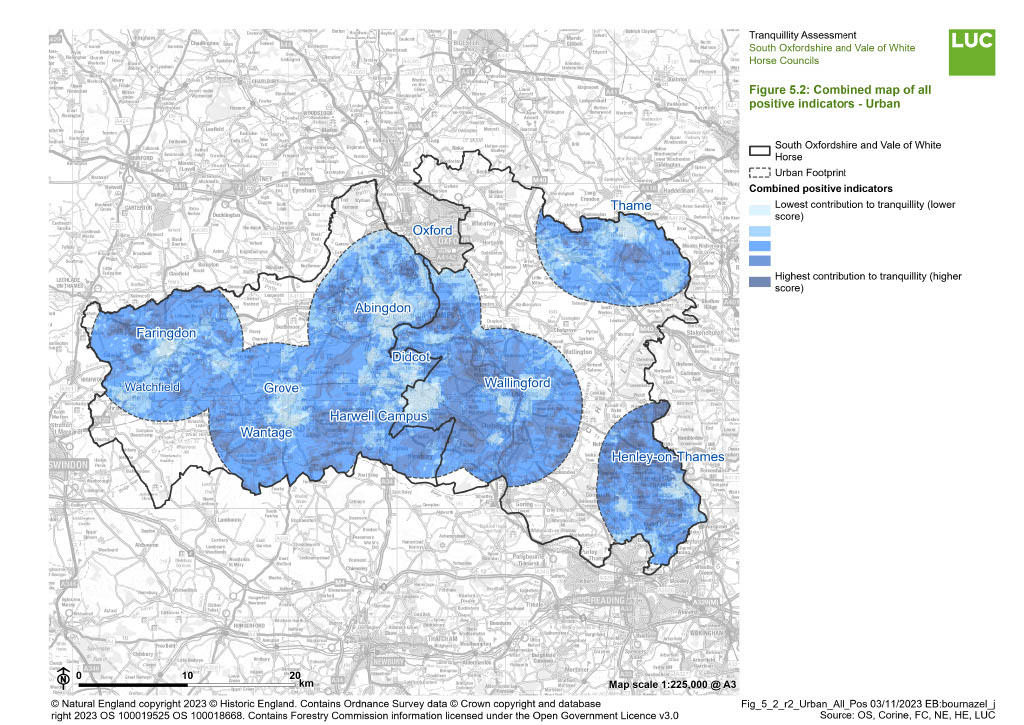
Once all the analysis had been run for all the positive indicators for All South and Vale and Urban, the indicators were combined to give an overall positive score as shown in Figure 5.1 (can be explored in more details in the Results interactive web map) and Figure 5.2. A higher score means the pixel is more tranquil.
Figure 5.1: Combined map of all positive indicators - all South and Vale

×![]()
Figure 5.1: Combined map of all positive indicators - all South and Vale
Figure 5.2: Combined map of all positive indicators - Urban
×![]()
Figure 5.2: Combined map of all positive indicators - Urban
Combined negative indicators
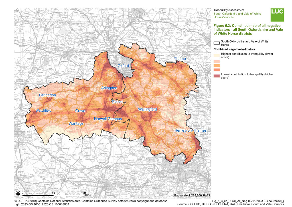
Once all the analysis had been run for all the negative indicators for All South and Vale and Urban, the indicators were combined to give an overall negative score as shown in Figure 5.3 (can be explored in more details in the Results interactive web map) and Figure 5.4. A higher score means the pixel is less tranquil.
Figure 5.3: Combined map of all negative indicators - all South and Vale
×![]()
Figure 5.3: Combined map of all negative indicators - all South and Vale
Figure 5.4: Combined map of all negative indicators - Urban

×![]()
Figure 5.4: Combined map of all negative indicators - Urban
Tranquillity in South Oxfordshire and Vale of White Horse Districts
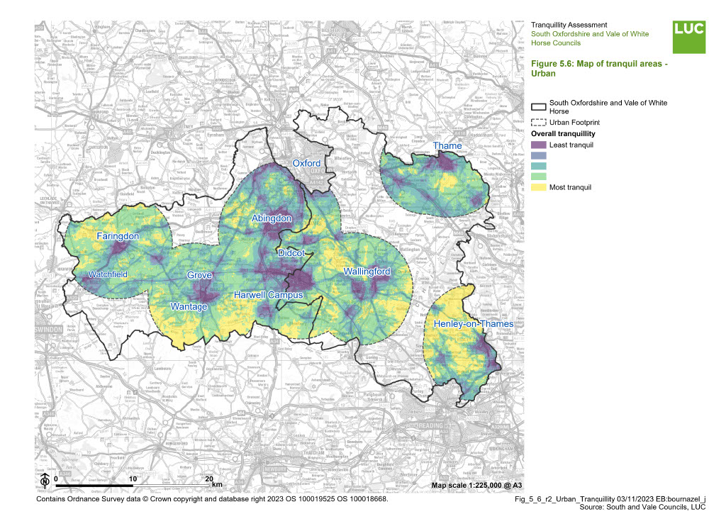
Tranquillity in South and Vale and Urban was calculated as the difference between the total positive score and total negative score, displaying the spatial distribution of relative tranquillity as shown in Figure 5.5 (can be explored in more details in the Results interactive web map) and Figure 5.6.
Figure 5.5: Map of tranquil areas - all South and Vale

×![]()
Figure 5.5: Map of tranquil areas - all South and Vale
Figure 5.6: Map of tranquil areas - Urban
×![]()
Figure 5.6: Map of tranquil areas - Urban
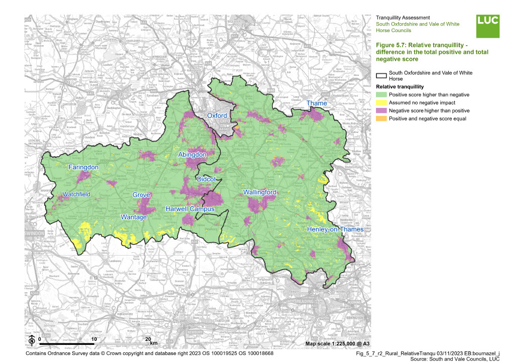
Figure 5.7 aims to determine which areas of South Oxfordshire and Vale of White Horse Districts are dominated by negative indicators, as well as areas where positive indicators of tranquillity dominate. It also shows areas of assumed no negative impact, which are areas where the negative indicators were all scored 0, and therefore the tranquillity score is only driven by the positive indicators.
Figure 5.7 Relative tranquillity - difference in the total positive and total negative score
×![]()
Figure 5.7 Relative tranquillity - difference in the total positive and total negative score