Chapter 4 – Creating the map
This section sets out the method followed to create the data and subsequent maps that support this assessment. Appendix D provides further detail on the approach. The level of detail provided allows for the method to be replicated in the future.
Obtaining night light imagery from satellites
In October 2011, the United States National Oceanic and Atmospheric Administration (NOAA) launched the Suomi National Polar-orbiting Partnership or Suomi NPP. This sun-synchronous polar-orbiting satellite flies over any given point on the earth’s surface twice each day at roughly 1:30 a.m. and 1:30 p.m. (local solar time). The Visible Infrared Imaging Radiometer Suite (VIIRS) is one of the instruments on board this satellite and it captures visible and infrared imagery to monitor and measure processes including wildfires, ice motion, cloud cover, and land and sea surface temperature amongst other things.
The VIIRS sensor collects data in a number of channels including the Day/Night Band (DNB). The DNB sensor determines on-the-fly whether to use its low, medium or high gain mode to gather information on the amount of light emitted. By being able to alter the exposure time, if a pixel is very bright, a low gain mode on the sensor prevents the pixel from over-saturating. The opposite occurs if a pixel is dark.
Important note: Whilst the data captured by the Suomi-NPP DNB offers significant improvements over that of previous satellite programmes, the Suomi-NPP DNB lacks sensitivity at wavelengths shorter than 500 nanometres. Because of this, the blue-light emission peak of white LEDs is not detected.
This means that the “blue blindness” of the VIIRS DNB could falsely suggest a reduction in light pollution in rural and urban areas, whereas the brightness of the sky as seen by human eyes may in fact increase. This is a known limitation of this data.
The electromagnetic spectrum that is visible to the human eye is between 380 nanometres-700 nanometres and local authorities in the UK have been upgrading their street lights to LEDS since 2011.
Selecting the best data
Global monthly average night light composite images are produced by the Earth Observation Group at Colorado School of Mines. The latest monthly composite data available at the time this study was conducted was November 2022. Therefore, monthly composite data from December 2021 were downloaded for review and analysis in order to cover a full year. Each monthly dataset is supported by a second image which shows the number of cloud free nights used to make up the night light monthly average image.
To select a baseline dataset to use in the creation of the South Oxfordshire and Vale of White Horse dark skies map, all the datasets were brought into Geographic Information System (GIS) software – ESRI ArcMap. Each month was viewed alongside its cloud free composite data to establish the extent to which cloud cover was impacting the data. Months when there were a high number of nights with a lot of cloud cover over the study area were dismissed from the analysis. These maps can be seen in Appendix B.
After a thorough review, January 2022 was selected as the best month in terms of low influence of cloud cover and has been used to create the dark skies/light pollution map for the study area.
Data preparation and calibration
Over the lifetime of this satellite, the analytical methods used to produce this data have been altered and refined. This has had the effect of causing some variation between the different years in how sensitive the data is to low light levels. Two major changes were made in 2014 and 2017:
- From 2014 onwards, the dataset had a stray light correction applied, which means that there is less light overspill from one pixel to adjacent pixels.
- From 2017 onwards, the method of calculating radiance changed, which has the effect of areas with no, or very low, light emission levels appearing brighter than would be expected.
In order to correct for the differing sensitivity of the data the selected month was amended to improve its level of brightness. This process is called zero-point calibration.
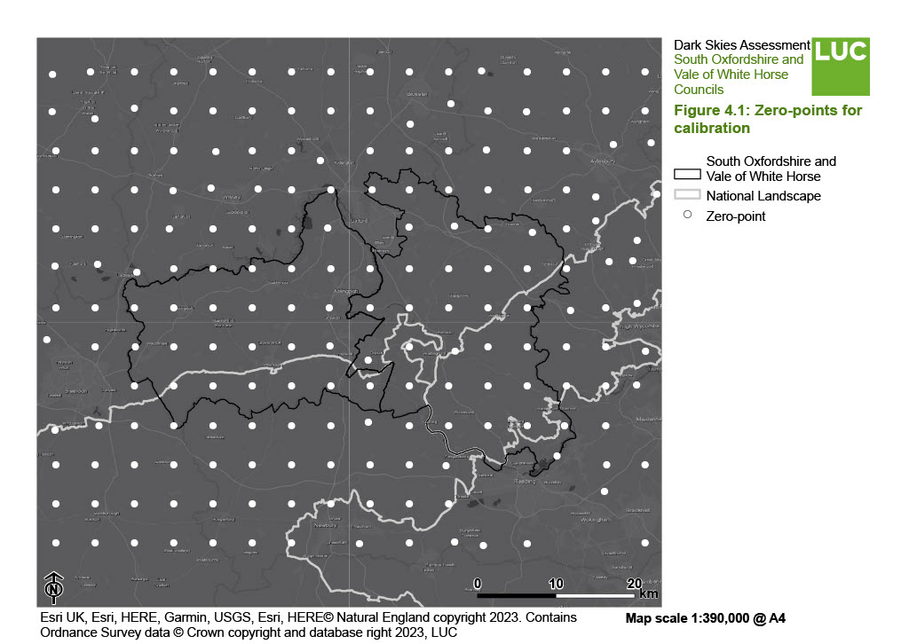
The method for performing this calculation was adapted from that created by Coesfeld et al (2020) in the paper – Reducing Variability and Removing Natural Light from Nighttime Satellite Imagery: A Case Study Using the VIIRS DNB [See reference [i]]. The method, as detailed in the article, covered the full globe, and involved creating a 5 degree grid of points, and micro-siting those to locations where there is no light emission, for example in the ocean or in unpopulated areas. The values of the light emission data are then measured at those points. Since it can be confirmed that there is no light emission in those locations, the difference between 0 and the actual light emission recorded gives a measure of the offset between the recorded value and reality.
The offset values across all these points were then interpolated to a global raster dataset, which is combined with the light emission dataset to perform a broad calibration to 0 of those locations that should show no emission.
As this study only covers a fraction of the globe, it was necessary to adapt the point grid to suit the smaller study area. Instead, a grid was created with points at 5-kilometre intervals, and then the same micro-siting exercise was performed as in the paper, with points being limited to moving within 2 kilometre of their original location. If no locations with zero light emission could be found within this distance, the point was removed.
The grid of points used can be seen in Figure 4.1. The coordinates of each point are detailed in Appendix C.
The data has been georeferenced and clipped in GIS to the study area boundary with an additional 6 kilometre buffer around the edge (to ensure the entire area is covered by complete pixels). The data has also been resampled to 400m x 400m pixel size.
[i] Coesfeld, J., Kuester, T., Kuechly, H.U., Kyba, C.C.M. (2020) Reducing Variability and Removing Natural Light from Nighttime Satellite Imagery: A Case Study Using the VIIRS DNB, Sensors; 20(11):3287. – https://www.mdpi.com/1424-8220/20/11/3287
Figure 4.1: Zero-points for calibration
×![]()
Figure 4.1: Zero-points for calibration
Data presentation
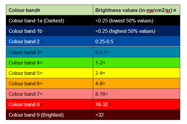
The units of measurement of the light pollution dataset are nanowatts per centimetre squared per steradian (nw/cm2/sr). In simple terms, the lower the value, the lower the light pollution levels (and the darker the skies are likely to be) and the higher the values, the greater the levels of light pollution. The data values were initially divided into nine colour bands ranging from dark blues (low brightness values) to dark reds (high brightness values) to match the existing national map classification.
Given the high proportion of the districts falling in the darkest category, it was considered sensible to explore differentiation within this band by creating sub-categories within the national equivalent band 1. The spread of the darkest pixels was split by quantile classification, allowing differentiation between the lowest value 50% pixels scoring <0.25 as colour band 1a, and the higher value 50% of pixels scoring <0.25 classified as colour band 1b as shown in Table 4a.
Table 4a: Colour bands and values
×![]()
Table 4a: Colour bands and values
Further detail on the data source, units of measurement and how the data has been processed can be found in Appendix D. The methodology correlates with the CPRE England’s Light Pollution and Dark Skies report produced by LUC in May 2016.
Important note:
Although the methodology correlates with the CPRE England’s Light Pollution and Dark Skies report (2016), the 2022 satellite data used to create the current map is not comparable with the 2015 data that was used for the CPRE national map. The way the VIIRS data is processed has changed multiple times since 2016 and the calibration method applied here did not exist in 2016. Therefore, results from this report are not directly comparable to the dark skies statistics measured for districts in the CPRE report (2016).
The Dark Skies Results Map shows the resulting Dark Skies/Light Pollution map once the data has been classified into the colour bands shown in Table 4a. The map clearly identifies the main concentrations of night time lights, creating light pollution that spills up into the night sky.
By contrast, the map also identifies areas where there is very little night time lighting and where the sky would be expected to be truly dark without the problems caused by light pollution.